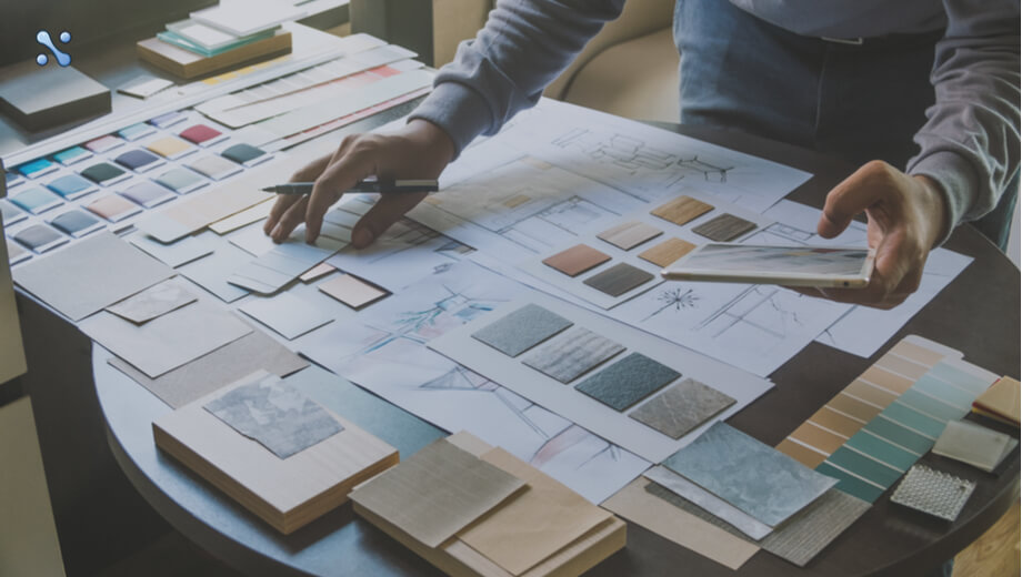

Google has been among the most influential players in the digital domain for years now. Hence, their design system has a major impact on the manner how digital products are created. Material Design is the design language followed by Google and features a comprehensive set of guidelines meant for motion, interaction, and visual design across devices and platforms. While Material Design was introduced in the year of 2014, its popularity accelerated quite recently. A good number of major UI UX Design Companies have begun to integrate material design into both their web-bound and android projects.
The prime notion behind developing material design principles was to create a design that resembles real-world objects but with a distinctive level of abstraction. While a design should not look realistic enough to impersonate the real-world equivalent of a certain element, it should be effective in conveying the idea of “material” to the users. Broadly speaking, material design takes inspiration from the physical world to create a brand new visual language that resembles a few of its properties. It emphasizes bringing an extent of physicality into the overall digital experience.

Here are some of the major material design guidelines as per Google:
-
- Usage of shadows for depicting hierarchy: A host of usability issues took place in the original flat design that did not have shadows. When it comes to material design, shadows are considered to be quite valuable and not unnecessary chrome. Edges, surfaces, lighting, and realistic shadows are among the core components of material design and tend to be leveraged by digital transformation service providers to depict the properties of distinctive real-world items. Even though adding depth to design is pretty important, only minimum effective quantity should be used to make sure that the end outcome is impactful enough.
-
- Usage of shadows as the primary tool for conveying the hierarchy of varied elements that ultimately combine to become a completed design can help in making a project more user-friendly. By choosing what can cast a small, realistic shadow on what, you shall be presenting the visual hierarchy of multiple elements, alongside the layers they are on. In this situation, what matters the most is the structure of the design and whether or not the shadow structure makes sense to the human eye, i.e. if it manages to reflect the concept of real materials.
-
- Use bold hues: Color palettes are among the vital aspects of the design language used while creating online products. Trying to be graphic, intentional, and bold are some of the main principles of material design. As such a design approach is fairly minimalistic; it does not use many stylistic tastes and design tools. Hence, designers have to go around this restriction to identify other ways to create the right focus and meaning. One of the key things they have left to use is color, more specifically hues that are bold and eye-catching. These hues make interacting with a design more fun and enjoyable for the users.
-
- Usage of accent and primary hues: To create a great UX, limiting the selection of hues by selecting 3 colors from the primary palette and a single accent hue from the secondary one shall be a good move. The primary hues can be used for fonts, backgrounds, fields, and other important components of the interface. Much like its name suggests, accent colors are simply meant to provide extra leverage for displaying the main component on a particular page or screen. As a result, it should be chosen in contrast to the primary color.
-
- Make use of whitespace: A lot of inspiration for a material design is taken from the traditional print design and its associated principles, such as the prominence of whitespace. Whitespace can improve the text layout and typography of a page quite significantly, and are considered to be among the major components of any material design. It is among the most efficient tools available to providers of digital transformation solutions, for the creation of impeccable user experience. Whitespaces help in creating areas of focus and magnetizes the attention of the users towards it.
-
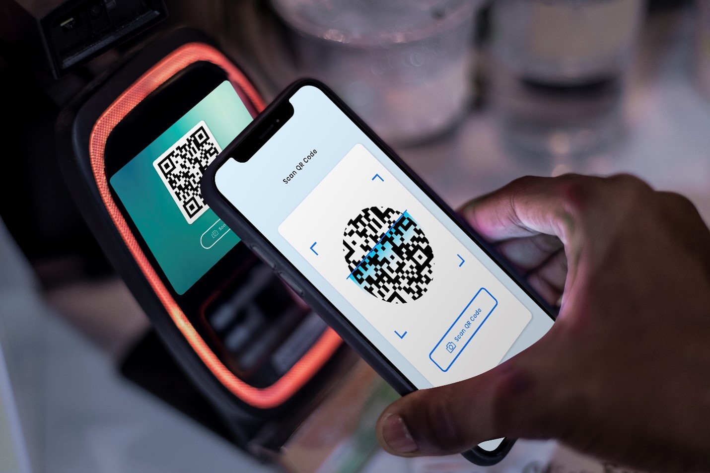
- Usage of edge-to-edge images: As the material design is largely image friendly, one should give them a leading role in their design. The images used in such a design approach are typically featured in an edge-to-edge, full-bleed fashion. This implies that there are no margins given between the edge of the screen/page and the edge of the image. If executed perfectly, this can contribute to the creation of a memorable UX for the users, while also equipping the designers with more tools than layers, shadows, and hues.
- Extract hues from images for designs that are image-based: Google encourages designers to extract hues from the images they are using in their designs, and subsequently make them a part of the palette. Doing so helps in developing a consistent UX, and gives the impression that every component of the page fits perfectly together.
-
- Incorporate motion: According to Google, motion gives meaning. Based on the same principles, the material design uses motion to interact with the users impeccably and letting them know how to explore the design. There are several ways to use motion in the design. For example, giving the user feedback on the action they have just performed. If they have clicked on an option, an animation can pop up depicting that their input has been received.
-
- Make motion genuine: Simply incorporating motion into the design is not enough, it has to look authentic to impress the users. With the rapid development taking place in the technology domain, any fake motions are not enough to engage the users. The motions used must be well planned, and align with the manner real-world objects tend to interact with each other. There is an entire section devoted by Google to the aspect of authentic motion. Under that, they discuss the ways to introduce laws of physics, including deceleration, acceleration, weight, and mass into the motion. The guidelines are given by Google also talk about the way easing works, which is a way of making an animation look more natural by changing the speed of movement at diverse moments in time. A motion can only be impactful and can enrich the interface if it manages to mimic real-world objects when it comes to material design.
-
- Ensure the design is responsive: In the contemporary digital landscape, a high priority should be given to making digital products usable and accessible on all devices, no matter the screen size it has. Beyond this, the user experience provided should also remain consistent across screen sizes, to make sure that the users do not get confused as they switch devices and find an all-new interface altogether. This means the design has to be responsive. Fortunately, creating responsive designs has become way easier than before today, owing to the vast availability of modern frameworks.

Verdict
Material design is an extensively used digital design philosophy today that can go a long way in enabling designers to augment their unique design style. When used smartly and effectively, material design can help people to create a highly positive digital experience for users.
Reference: [1]
FAQs About Material Design in Digital Experience
Q. What is Material Design?
A. Material Design is a design language developed by Google that uses grid-based layouts, responsive animations, padding, depth effects like lighting and shadows to create more realistic, interactive, and intuitive user interfaces.
Q. How Does Material Design Use Shadows?
A. Material Design utilizes shadows to depict hierarchy and depth in interfaces. Shadows help define relationships between elements by showing which elements are raised or closer to the user, thereby guiding visual interaction.
Q. Why are Bold Hues Important in Material Design?
A. Bold hues are crucial in Material Design to create focus and meaning, as the approach is minimalistic. Vibrant and eye-catching colors enhance user engagement and make the interface more enjoyable.
Q. What is the Significance of Using Whitespaces in Material Design?
A. Whitespace in Material Design is inspired by traditional print design principles. It’s used to improve layout and typography, creating focus areas and directing user attention effectively.
Q. How are Images Used in Material Design?
A. Material Design favors edge-to-edge, full-bleed images, meaning there are no margins between the image edge and the screen/page edge. This approach provides a more immersive experience and utilizes images effectively in the design.
Q. What is the Role of Motion in Material Design?
A. Motion in Material Design is used to provide meaningful interaction and feedback to users. It guides users on how to navigate the interface and gives feedback on actions performed.
Q. How Does Material Design Ensure Motion Authenticity?
A. Material Design ensures motion authenticity by incorporating real-world physics principles like acceleration, deceleration, and easing into animations. This makes the motion appear more natural and intuitive.
Q. What’s the Importance of Color Selection in Material Design?
A. Selecting appropriate colors in Material Design involves choosing a limited palette from primary and secondary hues for consistency and contrast. This helps in highlighting key elements and maintaining visual harmony.
Q. Why is Responsiveness Key in Material Design?
A. Responsiveness ensures that designs adapt to various screen sizes while providing a consistent user experience. This adaptability is crucial in Material Design for maintaining familiarity across different devices.
Q. Can Material Design Be Customized for Different Brands?
A. Yes, Material Design can be customized to fit different brand identities. While it provides a framework for design, it’s flexible enough to be adapted to various visual styles and branding requirements.
About Author
Hitesh Dhawan
Founder of Neuronimbus, A digital evangelist, entrepreneur, mentor, digital tranformation expert. Two decades of providing digital solutions to brands around the world.